Published on Wednesday, 19 Dec, 2012
Xbox SmartGlass
I downloaded the Xbox SmartGlass app for Android a while ago, but hadn’t got around to actually trying it until a couple of days ago.
For those of you who don’t know what SmartGlass is, it “turns your mobile phone or tablet into a second screen that intelligently interacts with your Xbox 360 to elevate your entertainment experience” – http://www.xbox.com/en-GB/smartglass.
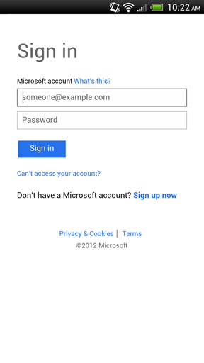
I wanted to do something simple – sign in and check my messages – so I loaded up the app and after a rather nice, clean loading animation I was presented with the sign in screen.

Those of you who have been following my Xbox saga over the last year or so will know that I have had, shall we say, some battles with the service over my account, and that I have an incredibly obscure, lengthy Xbox Live password which I change frequently. I don’t know any of my passwords and keep them all in a password manager.
No problem, I loaded up my password manager app, copied my password and returned to the SmartGlass app. It had returned to the loading screen and hadn’t maintained its state of keeping my username. No worries, I re-entered the username and went to paste the password.
Pasting isn’t allowed. This poses a problem for me. As I said, I have a lengthy, complicated password which I don’t know. Since the app also restarts from the loading screen every time you switch apps typing the password in segments was also not an option. I resorted to copying my password to my tablet, then referring to that. Problem solved you would think. Apparently not!
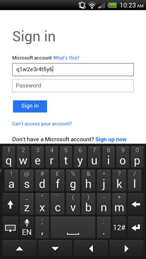
For some reason the app has a strange quirk whereby if you hold down a key (my preferred method for accessing numbers/characters from the letter interface rather than switching to a number/character-specific ‘page’ on the keyboard) you get the initial button press as well as the end result – i.e. if you hold q aiming to enter 1, you get ‘q1’. It took me a while to realise what was happening. After repeatedly entering my password I was getting feedback that my password was over the maximum character length, and also couldn’t figure out why I kept getting an additional character before the @ in my username.

I’m not sure how this bug got through the testing process, however it flagged up another important consideration – some users prefer the option to see the password they are entering in plain text, not obscured. Some users will not, but a simple checkbox option to show password will cover both camps. This not only helps with rare instances such as with this bug, but also helps users who may have mis-typed their password check it before being frustrated by having to enter it again, especially if it’s as long as mine.
What should have been a simple sign in process ended up taking me quite a while. By the time I had signed in I completed my goal, but had no desire to play with the app itself.
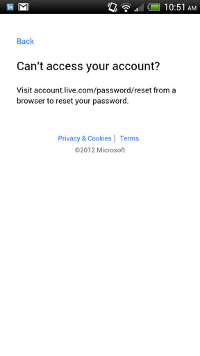
On writing this blog post I decided to dig a bit deeper. I hadn’t used the ‘Can’t access your account?’ link on the sign in screen previously, but it was hugely disappointing. Instead of taking the user directly to a help or recovery page, it simply loaded up a screen in-app, with a text-based link that wasn’t even clickable. In contrast, the Sign Up link at least takes the user through to a web page, however this is not optimised for mobile devices. Privacy & Cookies, Terms, and What’s this? all open a simple page of text in-app, but pressing the ‘Back’ link again reloads the app from the start, losing anything the user may have entered in the sign in boxes. In addition What’s this? also contains another unclickable link.

In summary, the following things could be improved with the SmartGlass sign in process:
• Maintain the state of variables previously entered, allowing users to flip between this app and others.
• Allow paste in the username and password fields.
• Fix the bug where extra characters are included on holding down keys.
• Give the user the option to show their password.
• Ideally take the user straight through to where they can complete tasks such as recovering their account. If providing links, ensure they are selectable, not just text.
• When taking users through to other services outside of the app, ensure the experience is as consistent as possible. Don’t provide a mobile-optimised experience which links through to one which is not.
I would have been happy to provide the above to Microsoft in a constructive fashion, but there was no way to do so. Having better feedback mechanisms in the app itself could ensure that these frustrations get passed back more effectively and accordingly help provide a better overall experience. This obviously requires resources to monitor any communications, but I imagine these processes are already in place (don’t tell me all of my ‘This program has encountered an error and needed to close’ reports have gone into a black hole!) at Microsoft. Surfacing the processes to users better could provide Microsoft with valuable information.
 Sally Lait